Monday, November 21, 2011

Population profile


http://www.census.gov/geo/www/maps/2010_census_profile_maps/census_profile_2010_main.html

A population profile is made up of an overview of demographic statistics in the United States. This map shows the population of Florida and the dark blue shades shows the higher populations.

Scatterplot


http://onlinestatbook.com/chapter4/pearson.html

Scatterplots allow a researcher to examine two different date points and to find correlation between the two values. This graph depicts a perfect linear relationship as X increases, Y decreases.

Index Value Plot


http://waterwatch.usgs.gov/new/?m=real&w=plot&r=nm

An index value plot is a means to depict the relativity of all values to an indexed value. Graphic visualization is utilized in heavy measure on stock market analysis.

Accumulative Line Graph or Lorenz curve


http://www.google.com/imgres?imgurl=http://image.absoluteastronomy.com/images/encyclopediaimages/l/lo/lorenz-curve1.png&imgrefurl=http://www.absoluteastronomy.com/topics/Lorenz_curve&usg=__wWXZzxAnv84xiAXWCOQhENC8FFM=&h=312&w=550&sz=28&hl=en&start=0&zoom=1&tbnid=3lVIUDbwmYY4cM:&tbnh=96&tbnw=170&ei=WkgiTsq3OLHDsQLeu5GmAw&prev=/search%3Fq%3DAccumulative%2Bline%2Bgraph%2Bor%2BLorenz%2Bcurve%26hl%3Den%26safe%3Doff%26biw%3D1600%26bih%3D722%26tbm%3Disch&itbs=1&iact=hc&vpx=435&vpy=103&dur=1757&hovh=169&hovw=298&tx=149&ty=75&page=1&ndsp=32&ved=1t:429,r:2,s:0

The Lorenz curve is a graphical representation that shows the cumulative distribution function and probability distribution of wealth. It is used to describe the inequality in wealth or size and is formed by plotting the cumulative distribution of the amount of the variable against its frequency.

Bilateral Graph


http://seekingalpha.com/article/241440-will-october-s-improved-trade-deficit-continue

A bilateral graph compares 2 or more variables side by side, relative to a bar graph that overlap one another. In this graph the blue line shows the annual population change and the red line shows the worlds population.

Nominal area Choropleth Map


https://courseware.e-education.psu.edu/courses/geog482/policies.shtml

Nominal Area Choropleth Map usually will show quantitative differences for different variables. Generally it can not be looked at quantitatively and this map illustrates the number of minority groups in each state just by looking at the different shades on the key for direction.

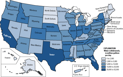
Unstandardized Choropleth Map

http://pubs.usgs.gov/fs/2005/3051/images/2000choropleth.gif

An unstandardized choropleth map uses the raw numbers from the data rather than normalizing or standardizing the values. They utilize data sets of raw numbers and as a total value. This unstandardized choropleth map displays the number of water withdrawls by state across the United States.