Monday, November 21, 2011

Star Plot


http://images.google.com/imgres?imgurl=http://www.humble-inc.com/app99-2-fig4.gif&imgrefurl=http://www.humble-inc.com/rof_app99-2.htm&usg=__JMw9ULFCr4kmZdXRRuPCkhHydzE=&h=248&w=253&sz=7&hl=en&start=7&um=1&tbnid=XVlioHOIvOTxlM:&tbnh=109&tbnw=111&prev=/images%3Fq%3Dstar%2Bplots%26ndsp%3D18%26hl%3Den%26rls%3Dcom.microsoft:*:IE-SearchBox%26rlz%3D1I7GZFA%26sa%3DN%26um%3D1

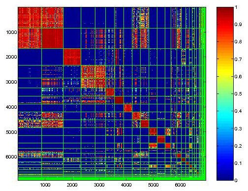
A star plot is a graphical data analysis technique for examining the relative behavior of all variables in a multivariate data set. This is used to compare the relative behavior of all of the variables in a multivariate data set.


Stem and Leaf plot


http://www.google.com/imgres?q=stem+and+leaf+plot&um=1&hl=en&client=safari&sa=N&rls=en&biw=1205&bih=706&tbm=isch&tbnid=u_WA_oGNCq-xKM:&imgrefurl=http://www.icoachmath.com/math_dictionary/Stem-and-Leaf_Plot.html&docid=eDpuYSVZUplgmM&imgurl=http://www.icoachmath.com/image_md/Stem-and-Leaf%252520Plot2.jpg&w=173&h=144&ei=aZrKTtzBNvHFsQLq6f1L&zoom=1&iact=rc&dur=408&sig=112690992776489872722&page=1&tbnh=115&tbnw=138&start=0&ndsp=19&ved=1t:429,r:1,s:0&tx=36&ty=63

Stem and leaf plot is a way of organizing data in order of place value. The numerical data is separated by leaves and stems and this plot shows the number of students enrolled in a dance class in the past twelve years.

Box plot


http://www.google.com/imgres?q=box+plot&um=1&hl=en&client=safari&sa=N&rls=en&biw=1205&bih=706&tbm=isch&tbnid=SFV1JNpq2hA8CM:&imgrefurl=http://www.stat.yale.edu/Courses/1997-98/101/boxplot.htm&docid=2fsPrRdltC50HM&imgurl=http://www.stat.yale.edu/Courses/1997-98/101/boxplot.gif&w=400&h=291&ei=3ZnKTrLaNsWq2gXpzsjLDw&zoom=1&iact=rc&dur=381&sig=112690992776489872722&page=1&tbnh=137&tbnw=234&start=0&ndsp=17&ved=1t:429,r:6,s:0&tx=156&ty=61

A boxplot is a way of summarizing a set of data measured on an interval scale. It is often used in exploratory data analysis. It is a type of graph which is used to show the shape of the distribution, its central value, and variability.

Histogram


http://www.google.com/imgres?q=histogram&um=1&hl=en&client=safari&sa=N&rls=en&biw=1205&bih=706&tbm=isch&tbnid=Sxc7Pz399pW6QM:&imgrefurl=http://www.vertex42.com/ExcelArticles/mc/Histogram.html&docid=UdZ2HB3NCE0zSM&imgurl=http://www.vertex42.com/ExcelArticles/mc/Images/ScreenCaptures/SalesForecast-Histogram.gif&w=496&h=294&ei=1ZjKTumbBdThsQLVp41a&zoom=1&iact=rc&dur=323&sig=112690992776489872722&page=1&tbnh=131&tbnw=221&start=0&ndsp=16&ved=1t:429,r:6,s:0&tx=123&ty=32
 A histogram is a graphical representation of some type of distribution of data over time. The histogram above indicates the simulation results in Monte Carlo over time.

Triangular Plot


http://www.google.com/imgres?q=Triangular+PLot&um=1&hl=en&client=safari&sa=N&rls=en&biw=1205&bih=706&tbm=isch&tbnid=lX7Ktsi11XtDBM:&imgrefurl=http://www.pmel.noaa.gov/maillists/tmap/ferret_users/fu_2007/msg00384.html&docid=78DiYy5ewF_ioM&imgurl=http://www.pmel.noaa.gov/maillists/tmap/ferret_users/fu_2007/jpgCqrZqdDwYG.jpg&w=463&h=464&ei=8JfKTsm_CMKEsgL26-A2&zoom=1&iact=rc&dur=1057&sig=112690992776489872722&page=1&tbnh=155&tbnw=152&start=0&ndsp=16&ved=1t:429,r:0,s:0&tx=89&ty=58

A Triangular plot represents three different variables such as percent of voters which can be seen in this particular map. It shows a comparison of three variables on three equal sided triangle.

Windrose Map


http://images.google.com/imgres?imgurl=http://www.climate.washington.edu/windrose/Seattle-WindRose.jpg&imgrefurl=http://www.climate.washington.edu/climate.html&usg=__Y4gDRmy4XNTuyH9SZa05PZSOYKo=&h=469&w=469&sz=32&hl=en&start=2&sig2=x1QROfPFLNDfDYwPSeFtIQ&um=1&itbs=1&tbnid=lOw-cI7hKNMNrM:&tbnh=128&tbnw=128&prev=/images%3Fq%3DWindrose%2Bmap%26um%3D1%26hl%3Den%26sa%3DN%26rls%3Dcom.microsoft:en-us%26tbs%3Disch:1&ei=TsS0S9OQF4P98Aabm-w5

A Windrose is used by meteorologist to determine the windspeed and the direction of the wind and how it is distributed at a certain location. This photo of a windrose map is of Seattle.

Similarity Matrix Map


http://cgi.mtc.sri.com/Cluster-Lab/01.jpg

Similarity Matrix Maps allow us to express similarity between two data points. Higher scores are given to data with higher similarity and vice versa. These are frequently used to line up DNA sequences.

Population profile


http://www.census.gov/geo/www/maps/2010_census_profile_maps/census_profile_2010_main.html

A population profile is made up of an overview of demographic statistics in the United States. This map shows the population of Florida and the dark blue shades shows the higher populations.

Scatterplot


http://onlinestatbook.com/chapter4/pearson.html

Scatterplots allow a researcher to examine two different date points and to find correlation between the two values. This graph depicts a perfect linear relationship as X increases, Y decreases.

Index Value Plot


http://waterwatch.usgs.gov/new/?m=real&w=plot&r=nm

An index value plot is a means to depict the relativity of all values to an indexed value. Graphic visualization is utilized in heavy measure on stock market analysis.

Accumulative Line Graph or Lorenz curve


http://www.google.com/imgres?imgurl=http://image.absoluteastronomy.com/images/encyclopediaimages/l/lo/lorenz-curve1.png&imgrefurl=http://www.absoluteastronomy.com/topics/Lorenz_curve&usg=__wWXZzxAnv84xiAXWCOQhENC8FFM=&h=312&w=550&sz=28&hl=en&start=0&zoom=1&tbnid=3lVIUDbwmYY4cM:&tbnh=96&tbnw=170&ei=WkgiTsq3OLHDsQLeu5GmAw&prev=/search%3Fq%3DAccumulative%2Bline%2Bgraph%2Bor%2BLorenz%2Bcurve%26hl%3Den%26safe%3Doff%26biw%3D1600%26bih%3D722%26tbm%3Disch&itbs=1&iact=hc&vpx=435&vpy=103&dur=1757&hovh=169&hovw=298&tx=149&ty=75&page=1&ndsp=32&ved=1t:429,r:2,s:0

The Lorenz curve is a graphical representation that shows the cumulative distribution function and probability distribution of wealth. It is used to describe the inequality in wealth or size and is formed by plotting the cumulative distribution of the amount of the variable against its frequency.

Bilateral Graph


http://seekingalpha.com/article/241440-will-october-s-improved-trade-deficit-continue

A bilateral graph compares 2 or more variables side by side, relative to a bar graph that overlap one another. In this graph the blue line shows the annual population change and the red line shows the worlds population.

Nominal area Choropleth Map


https://courseware.e-education.psu.edu/courses/geog482/policies.shtml

Nominal Area Choropleth Map usually will show quantitative differences for different variables. Generally it can not be looked at quantitatively and this map illustrates the number of minority groups in each state just by looking at the different shades on the key for direction.

Unstandardized Choropleth Map

http://pubs.usgs.gov/fs/2005/3051/images/2000choropleth.gif

An unstandardized choropleth map uses the raw numbers from the data rather than normalizing or standardizing the values. They utilize data sets of raw numbers and as a total value. This unstandardized choropleth map displays the number of water withdrawls by state across the United States.

Standardized Choropleth Map


http://www.infovis-wiki.net/index.php?title=Image:G156.gif

Standardized allows comparison of distribution among different areas and displays standardized information on a map. It is something illustrated people per square mile than displaying the total amount of people on the map.

Univariate Choropleth Map


http://people.cas.sc.edu/hardistf/images/univariate_map.jpg

Univariate choropleth maps are the most common choropleth map, they depict only one data set, broken into different colors or shades.  This particular map shows the poverty levels in the United States.

Bivariate Choropleth Map


http://www.google.com/imgres?q=Bivariate+choropleth+map&um=1&hl=en&client=safari&sa=N&rls=en&biw=1205&bih=706&tbm=isch&tbnid=rkp5MWC3Au-0IM:&imgrefurl=http://proceedings.esri.com/library/userconf/proc99/proceed/papers/pap171/p171.htm&docid=eSmLAlqP3DJ1lM&imgurl=http://proceedings.esri.com/library/userconf/proc99/proceed/papers/pap171/p1716.jpg&w=637&h=367&ei=4HDKTvrYNZSMsAKz6LA2&zoom=1&iact=hc&vpx=330&vpy=176&dur=1560&hovh=170&hovw=296&tx=107&ty=84&sig=112690992776489872722&page=1&tbnh=125&tbnw=217&start=0&ndsp=15&ved=1t:429,r:1,s:0

A Bivariate Map displays two variables on a single map by combining two different sets of graphic symbols or colors. It has potential to reveal relationships between variables more effectively than a side by side map.

Unclassed Choropleth Map


http://indiemapper.com/education/labs/1/Choropleth_Lab_Indiemapper.pdf

This map is an example of an unclassed choropleth map. The unclassed map is more accurate with regard to quantization error and appear to be superior visual quality. Assign shading or color to geographic areas as means of representing some measure of centrality with respect to a given characteristic.

Saturday, November 19, 2011

Classed Choropleth Map


http://personal.uncc.edu/lagaro/2101/2101_ProjectsS2001/beefmethaneJMK.gif


A Choropleth map is a map that represents data by the coloring or shading of well defined units. This map shows the methane emissions from beef cattle by county in North Carolina.

Range Graded Proportional Circle Map


http://gsc.nrcan.gc.ca/mindep/synth_dep/sedex/images/fig17.jpg

A Range Graded proportional Circle Map that uses circles based on there size to correlate directly to the quantity for that data given in the symbol key.

Continuously Variable Proportional Circle Map


http://propagandica.files.wordpress.com/2008/11/circlesizeisproportionaltotheamounteachcountysleadingcandidateisahead.jpg

A Continuously Variable Proportional Circle Map is a proportional circle that utilizes circles to create  point data. The circles are in proportion to the variable being measured and to each county in the United States.

DOQQ


http://www.crwr.utexas.edu/gis/gishydro00/Class/trmproj/Donnelly/termproject.htm

This map is an example of a DOQQ representation and are traditionally aerial photos by the USGS. We can see things that a normal photo cant capture, and each pixel is more detailed than a regular picture.

DEM


http://eros.usgs.gov/#/Find_Data/Products_and_Data_Available/DEMs

The map above illustrates a DEM (Digital Elevation Model) which represents the earths surface and includes all objects on it. Usually is only represents height.

DLG


http://weather.unisys.com/usgs/3sec/index.php

Digital line graphs combine planimetric and vector maps. They are very often used by the USGS, United States Geological Service to view roads, rivers, along with boundaries.

DRG


http://www.google.com/imgres?q=DRG&um=1&hl=en&client=safari&sa=N&rls=en&biw=1205&bih=706&tbm=isch&tbnid=hMCJU9OS73gweM:&imgrefurl=http://egsc.usgs.gov/isb/pubs/factsheets/fs08801.html&docid=ZTPaoJuKsveX7M&imgurl=http://egsc.usgs.gov/isb/pubs/factsheets/fs08801.graphics/drg.jpg&w=386&h=310&ei=KlXIToGSPKPj0QHLmMUv&zoom=1&iact=hc&vpx=464&vpy=190&dur=576&hovh=201&hovw=251&tx=170&ty=87&sig=112690992776489872722&page=1&tbnh=150&tbnw=185&start=0&ndsp=17&ved=1t:429,r:2,s:0

A DRG(digital raster graphic) is a scanned image of a U.S. Geological Survey standard series topographic map giving information of the earths surface. This map obviously illustrates a body of water flowing through the area of space.

Isopleth


http://www.cbr.washington.edu/papers/jim/draft.html


Isopleths are also comprised using contour lines which generalizes and simplifies data with a continuous distribution. We use isopleth maps to depict population densities, temperatures, pressures etc.  This particular map shows the wind velocity by month and latitude averaged over several years. The data here is shown as a third dimension on the map.

Isopach


http://www.noc.soton.ac.uk/gg/research/faulting/index.php

Isopach maps use circular connected regions in order to show the thickness or volume of a meteorological or geographical feature. Such as the image above is used to illustrate the volume of the amount of sediments that were disturbed on the ocean floor after an event.

Isohyets


http://www.google.com/imgres?q=Isohyets&um=1&hl=en&client=safari&sa=N&rls=en&biw=1205&bih=706&tbm=isch&tbnid=ZaQepPl7qBQrbM:&imgrefurl=http://www.scoop.co.nz/stories/AK0808/S00090.htm&docid=0eqi-GeHiyCetM&imgurl=http://img.scoop.co.nz/stories/images/0808/3d0ea09ab5cbfe1ff03f.jpeg&w=1928&h=2000&ei=BTzITrWKC-fj0QGHxMQy&zoom=1&iact=hc&vpx=581&vpy=175&dur=237&hovh=229&hovw=220&tx=138&ty=110&sig=112690992776489872722&page=1&tbnh=148&tbnw=142&start=0&ndsp=18&ved=1t:429,r:3,s:0

Isohyets Maps use connect boundaries within boundaries to show increased densities in a specific area. Like the map above this type of map is mainly used to show precipitation densities by showing changes of color.

Isotachs


http://www.google.com/imgres?q=isotachs&um=1&hl=en&client=safari&sa=N&rls=en&biw=1205&bih=706&tbm=isch&tbnid=3e37KZsqbzXT2M:&imgrefurl=http://www.erh.noaa.gov/btv/events/28Oct2008/ua2.php&docid=nutl4kYYRU_5XM&imgurl=http://www.erh.noaa.gov/btv/events/28Oct2008/300mb_isotachs_28_18z.gif&w=800&h=600&ei=TTfITvnuEoyAsgLguPkg&zoom=1&iact=rc&dur=492&sig=112690992776489872722&page=1&tbnh=149&tbnw=199&start=0&ndsp=15&ved=1t:429,r:1,s:0&tx=80&ty=47

Isotach Map uses a series of lines and colors overlaid over the geographical representation of land masses. This type of map is used to help analyze and combine complex meteorological information across the globe.

Isobars


http://www.google.com/imgres?q=isobars&um=1&hl=en&client=safari&sa=N&rls=en&biw=1205&bih=706&tbm=isch&tbnid=3Qrp816w6_mAsM:&imgrefurl=http://www.newmediastudio.org/DataDiscovery/Hurr_ED_Center/Hurr_Structure_Energetics/Closed_Isobars/Closed_Isobars.html&docid=zmyCLN0kgD4QWM&imgurl=http://www.newmediastudio.org/DataDiscovery/Hurr_ED_Center/Hurr_Structure_Energetics/Closed_Isobars/Closed_Isobars_fig02.jpg&w=471&h=481&ei=uC3ITommJ6OFsgKZvLFG&zoom=1&iact=hc&vpx=523&vpy=175&dur=104499&hovh=227&hovw=222&tx=81&ty=103&sig=112690992776489872722&page=1&tbnh=146&tbnw=143&start=0&ndsp=15&ved=1t:429,r:2,s:0

An isobar map depicts an area with lines drawn over the map connecting points of equal pressure.


http://www.google.com/imgres?q=LIDAR&um=1&hl=en&client=safari&sa=N&rls=en&biw=1205&bih=706&tbm=isch&tbnid=lNPx6fGBHc6IdM:&imgrefurl=http://rst.gsfc.nasa.gov/Sect8/Sect8_8.html&docid=VXIfnuICv1wWsM&imgurl=http://rst.gsfc.nasa.gov/Sect8/wtc-lidar092701-overview.jpg&w=586&h=450&ei=HSrITurKMYnh0QGd09A1&zoom=1&iact=hc&vpx=506&vpy=193&dur=200&hovh=197&hovw=256&tx=99&ty=90&sig=112690992776489872722&page=1&tbnh=153&tbnw=191&start=0&ndsp=16&ved=1t:429,r:2,s:0

LIDAR(Light Detection And Ranging) is an optical remote sensing technology that can the distance to or from other properties by using light and using pulses with a laser. This picture shows a three dimensional photo of buildings.

Doppler Radar


http://kwilklab.wordpress.com/2011/04/15/polarimetric-doppler-radar-rocks-the-house/

A Doppler Radar makes use of the Doppler effect to produce velocity data about objects at a distance. It does this by beaming microwaves signals towards a desired target and listening to its refection then analyzing how the frequency of the returned signal has been altered by the objects motion.

Black and White Aerial photo


http://pubs.usgs.gov/of/1995/of95-017/

Black and white aerial photos can provide valuable information that can not always be observed from someone on the ground. This photo is of Pearl Harbor and most people would not know the damage of the terrain with out an aerial photo.

Infrared aerial photo


http://sofia.usgs.gov/publications/fs/2004-3016/

Photography taken from the air where an infrared optical system projects an image directly on infrared film involving point to point variations in temperature of an area.

Cartographic animations


http://gislounge.com/armchair-storm-tracking/

A Cartographic animation is just like a cartographic map it is playing the figure on the map while it is moving. In the map above this is an illustration of hurricane Katrina in motion towards Louisiana, Alabama, and Texas.

Statistical Map


http://mappery.com/United-States-Travel-Time-to-Work-Statistical-Map

Statistical maps are a variation in quantity in a geographic location usually defined by political boundaries. The map above is an example of a statistical map and shows the mean travel time to work in every state.

Cartograms


http://www.google.com/imgres?q=cartograms&um=1&hl=en&client=safari&sa=N&rls=en&biw=1205&bih=706&tbm=isch&tbnid=wAB_-ucEEMlJNM:&imgrefurl=http://amphibiaweb.org/amphibian/cartograms/&docid=NHMotSnqfAJILM&imgurl=http://amphibiaweb.org/amphibian/cartograms/cart_threatenedpercentage.jpg&w=575&h=370&ei=sdvHTrzfFsPL0QGYltHuDw&zoom=1&iact=hc&vpx=544&vpy=208&dur=186&hovh=180&hovw=280&tx=166&ty=86&sig=112690992776489872722&page=1&tbnh=131&tbnw=203&start=0&ndsp=15&ved=1t:429,r:7,s:0

A cartogram is a map in which the space is distorted to convey information by scaling the proportion to  its population. This illustrates how big in comparison other countries are to each other.

Flow Map


http://www.google.com/imgres?q=flow+map&um=1&hl=en&client=safari&sa=N&rls=en&biw=1205&bih=706&tbm=isch&tbnid=0QA5kSzM_rE77M:&imgrefurl=http://infosthetics.com/archives/2007/02/cartographic_flow_map_layout.html&docid=6h7PsjiUJ9475M&imgurl=http://infosthetics.com/archives/flow_map_layout.jpg&w=400&h=200&ei=4dHHTubuNuXh0QHe-8Qb&zoom=1&iact=hc&vpx=88&vpy=261&dur=169&hovh=159&hovw=318&tx=245&ty=128&sig=112690992776489872722&page=1&tbnh=107&tbnw=213&start=0&ndsp=15&ved=1t:429,r:10,s:0

 ThisFlow map is used to show the movement of objects from one location to another such as the number of people in migration or what direction the population is distributed. They convey the population distribution with less visual clutter for the readers.

Isoline Map


http://www.google.com/imgres?q=isoline+map&um=1&hl=en&client=safari&sa=N&rls=en&biw=1205&bih=706&tbm=isch&tbnid=nYGh7XC_EdBcAM:&imgrefurl=http://www.grossmont.edu/judd.curran/outline1.htm&docid=a4SEU0lodjrRhM&imgurl=http://www.grossmont.edu/judd.curran/images/topo.jpg&w=400&h=288&ei=oc3HTtOPIYuCsALcse08&zoom=1&iact=hc&vpx=785&vpy=196&dur=121&hovh=190&hovw=265&tx=86&ty=126&sig=112690992776489872722&page=4&tbnh=132&tbnw=184&start=46&ndsp=18&ved=1t:429,r:10,s:46

Isolines are used to map a certain area such as elevation and use contour lines to connect points of equal value. This map of Utah uses contour lines to illustrate the elevation value over a ratio of land distribution.

Proportional Circle Map


http://www.neiu.edu/~ejhowens/377/examples.htm

Circle scaling is less difficult than with other symbol forms because the reader forms a picture of a quantitative distribution by examining how big the circle is in the map. This Proportional circle map illustrates the number of mexicans and the size of the circle presents how many mexicans live in that certain state.

Choropleth Map


http://www.clearlyandsimply.com/clearly_and_simply/choropleth-maps/

A Choropleth map shows which areas are shaded or patterned in proportion to the measurement of the statistical value such as population density. This map provides an easy way to visualize how a measurement varies across a geographic area.

Dot Distribution Map


http://www.census.gov/geo/www/maps/2010_census_nighttime_map/nighttime_map_2010.html

A Dot Distribution map portrays the distribution of population in the United States based on the population. This map obviously is taken at night and each white dot represents a number of people for example 1,000 people. The population is more disperse in the mid-west rather than the eastern part of the United States and the west coast.

Propaganda Map


http://www.google.com/imgres?q=sunshine+state&um=1&hl=en&client=safari&sa=N&rls=en&biw=1205&bih=706&tbm=isch&tbnid=gXCMrwWewobLxM:&imgrefurl=http://www.opensecrets.org/news/2010/04/oil-lobby-presses-drilling-sunshine.html&docid=NhUp3XDOJctLzM&imgurl=http://www.opensecrets.org/news/floridafunmap.jpg&w=466&h=600&ei=t7_HTp3jGcXj0gHVnIX1Dw&zoom=1&iact=hc&vpx=100&vpy=149&dur=16&hovh=255&hovw=198&tx=107&ty=127&sig=112690992776489872722&page=1&tbnh=152&tbnw=118&start=0&ndsp=18&ved=1t:429,r:6,s:0

Propaganda maps are subjective to the presentation and persuasion toward the public. It does inform the readers but allows us to make our own judgments. This propaganda map illustrates Florida as the Sunshine state but also that every county is described as a state, because Florida is a diverse state and a lot of people want to move there.

Hypsometric Map


http://www.reliefshading.com/colors/hypsometric.html

A Hypsometric map gives elevation by contour lines and also by shading and different tints so readers can see different areas of relief. The colors in this map illustrate the darker shades of green closer to ground level and yellow shades are of a higher elevation.

PLSS Map


http://www.google.com/imgres?q=PLSS+Maps&um=1&hl=en&client=safari&sa=N&rls=en&biw=1205&bih=706&tbm=isch&tbnid=kGHTZO5gDquizM:&imgrefurl=http://www.nationalcad.org/onlineed/standard/mn-exmpl.htm&docid=JWcQAkND3jWpEM&imgurl=http://www.nationalcad.org/onlineed/standard/mn-exmp2.gif&w=581&h=594&ei=hbvHTs_8OeqJsAKsuvQs&zoom=1&iact=hc&vpx=580&vpy=146&dur=369&hovh=227&hovw=222&tx=120&ty=122&sig=112690992776489872722&page=1&tbnh=160&tbnw=156&start=0&ndsp=15&ved=1t:429,r:2,s:0

A Public Land Survey System is a way of subdividing and describing lands in in the United States. All public lands are subject to subdivision by this rectangular system that shows in this PLSS map.

Friday, November 18, 2011

Cadastral Map


http://www.google.com/imgres?q=cadastral+map&um=1&hl=en&client=safari&sa=N&rls=en&biw=1205&bih=706&tbm=isch&tbnid=KGsxA6Yb5ghYeM:&imgrefurl=http://www.icsm.gov.au/mapping/maps_cadastral.html&docid=no1T0hqasuJkJM&imgurl=http://www.icsm.gov.au/mapping/images/isis_topo_cadastral.jpg&w=3107&h=3107&ei=E8XGTtbIOam62gWl5uXvDw&zoom=1&iact=hc&vpx=605&vpy=178&dur=7499&hovh=225&hovw=225&tx=118&ty=115&sig=112690992776489872722&page=1&tbnh=144&tbnw=144&start=0&ndsp=17&ved=1t:429,r:3,s:0

A Cadastral map shows detail on a specific location and provides measurements on each lot and everyone will understand where everything is on a map compared to actual life. They are usually a public matter. This map can portray boundary and property rights to the public.

Thematic Map

http://mrsgordonsspage.wikispaces.com/Thematic+Maps

A Thematic Map displays the spacial pattern of a social or physical population density, life expectancy or climate. Obviously this map of the United States use warm colors to portray the population density per square mile.

Mental Map


http://ocw.mit.edu/ans7870/MAS/MAS.965/f04/assignments/tripti/Assignment10/index.htm

This Mental Map obviously portrays an individuals perception on there internal map. This can be investigated by asking for directions to a landmark and asking one to draw a sketch map of an area do help other people which may or may not be true. This Mental Map is obviously drawn by there own point of view because the length and location of buildings are not accurate.

Planimetric Map

http://www.fws.gov/northeast/wetlands/images/planimetric_map.jpg

A Planimetric Map shows only horizontal position of features on the earths surface shows geographic objects, natural and cultural physical features without topographic features. This map portrays the direction of the water system and different rivers flowing in and out of the main water ways.

Topographic Map

 
http://www.google.com/imgres?q=topographic+maps&um=1&hl=en&client=safari&sa=N&rls=en&biw=1205&bih=706&tbm=isch&tbnid=WymXMkybDwGOgM:&imgrefurl=http://www.csus.edu/indiv/s/slaymaker/archives/geol10l/landforms.htm&docid=MSOK6xhnMdeTeM&imgurl=http://www.csus.edu/indiv/s/slaymaker/archives/geol10l/crater.jpg&w=428&h=393&ei=cpPGTpb9M6SisQKF_u1N&zoom=1&iact=rc&dur=593&sig=112690992776489872722&page=1&tbnh=140&tbnw=152&start=0&ndsp=18&ved=1t:429,r:9,s:0&tx=113&ty=77

 The topographic map uses contour lines to show natural and man made features which represent elevation. This map qualifies as a topographic map because the lines obviously have different widths which illustrate the different elevations.